Cutting allocation errors by 92% while handling 3x the payment complexity
Team
Product Designer
2 Engineers
Product Manager
My Role
End - to end UX
Architecture
Design
Duration
2 weeks

Why we designed this?
Property managers using RentOK were recording payments in 30 seconds. Fast, right?
WRONG!
That 30 seconds only captured the payment itself. What it didn't capture was the 8 minutes that came after ..managers opening spreadsheets, manually calculating how to split ₹50,000 across January rent, February advance, and a pending late fee.
They'd do the math, hope it was right, and pray the tenant wouldn't dispute it later.
When disputes happened, there was no record of why they allocated the money that way
No audit trail
No accountability
What we discovered
We interviewed 12 property managers and analyzed 500+ payment transactions. What we found:
73%
of payments involved multiple dues
45%
required advance adjustments
28%
were partial payments requiring custom allocation
The system was designed for the happy path. But the happy path was the minority.
The Impact
87%
of managers adopted automated allocation
92%
reduction in allocation errors


04 decisions that made it work
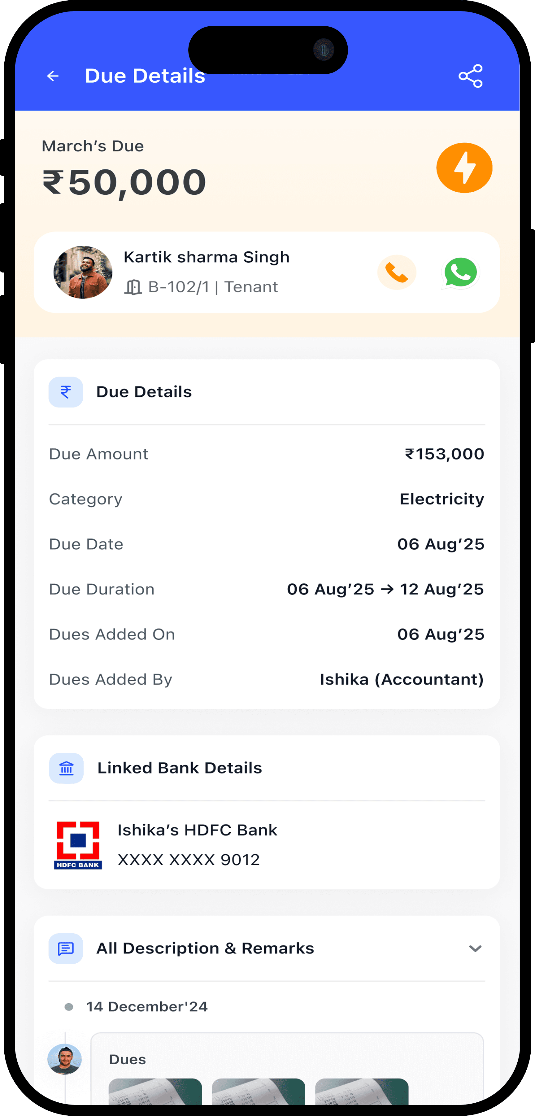
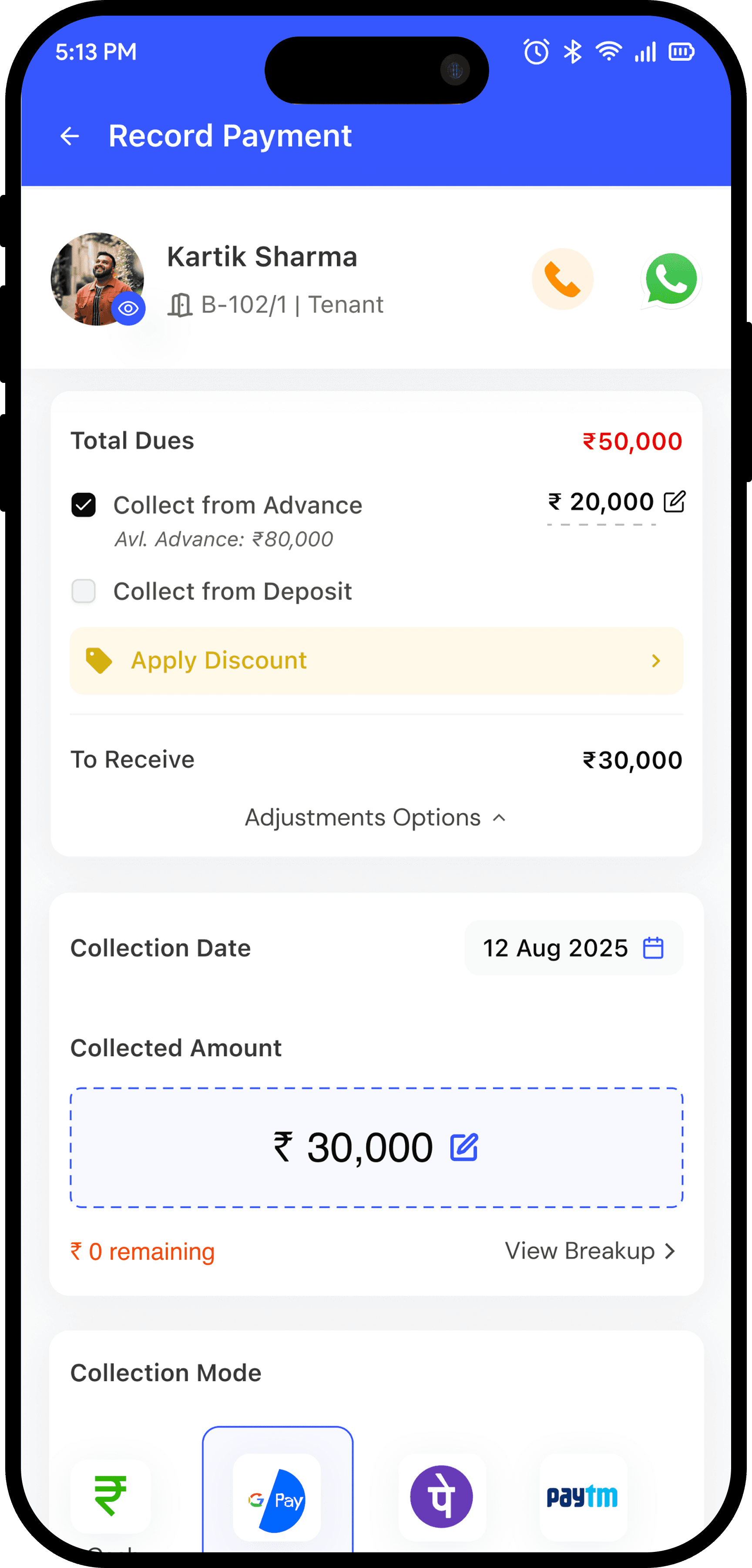
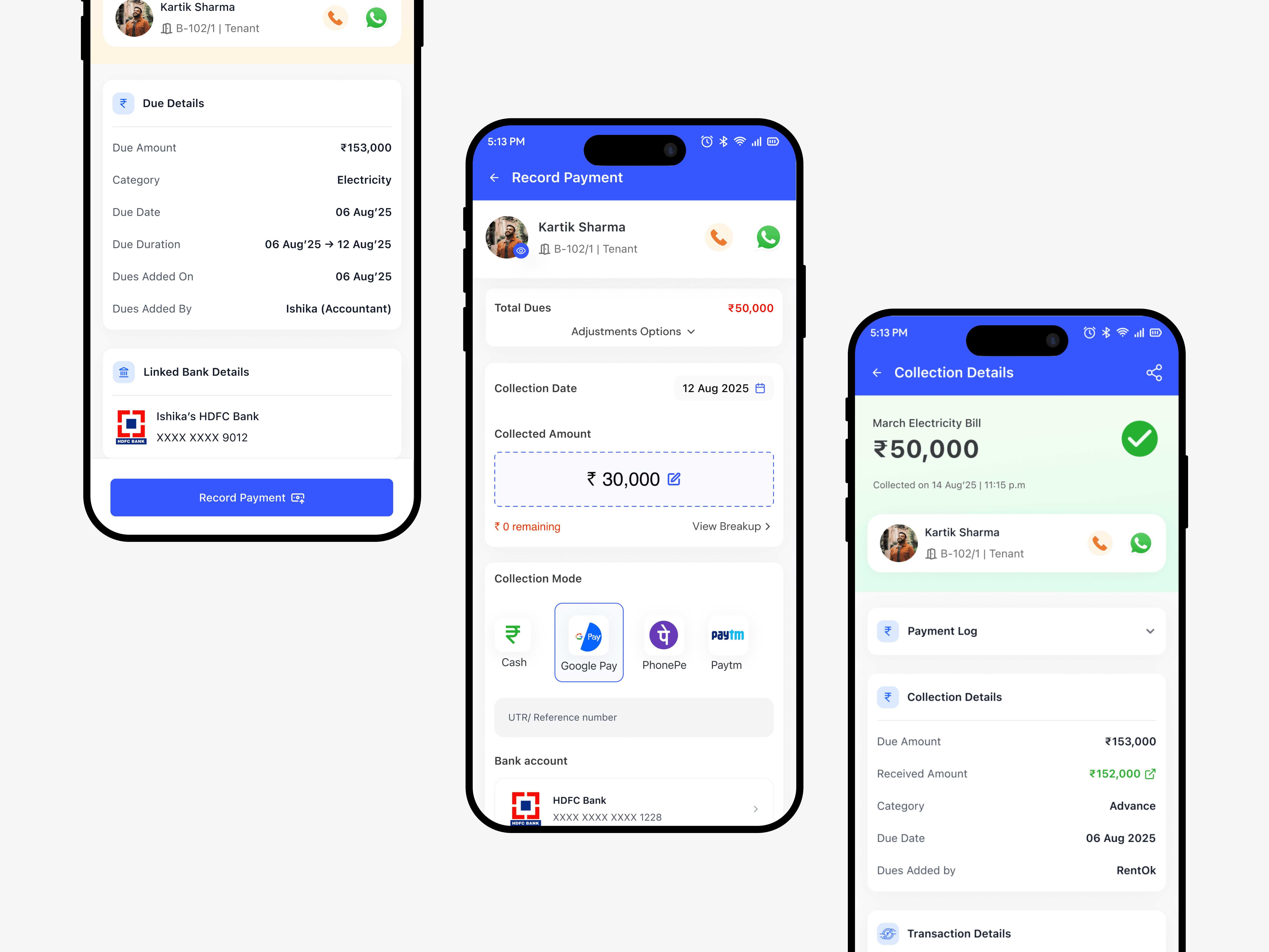
Net Payable + Dynamic Adjustments
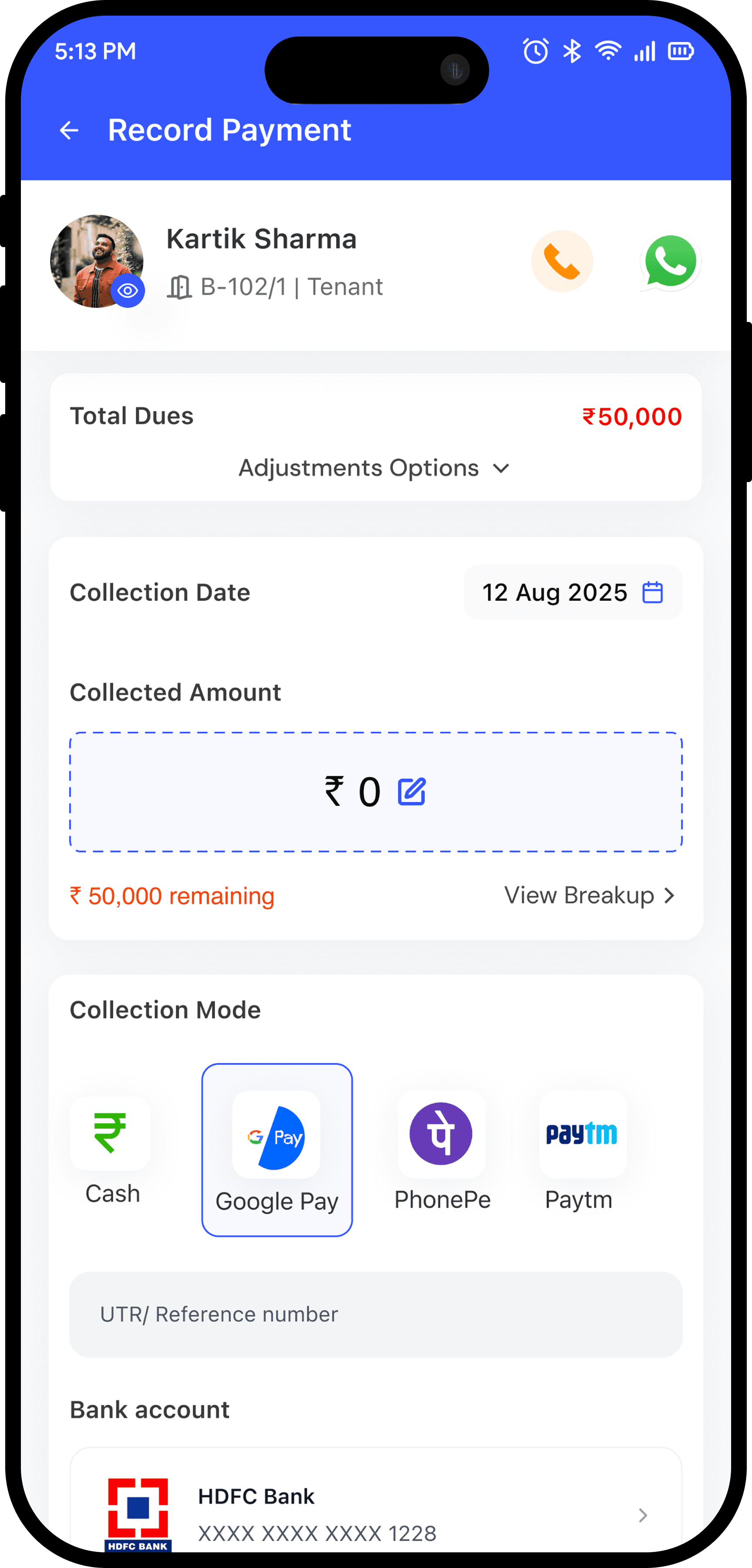
Shows total dues with real-time recalculations when applying advances, deposits, or discounts, giving managers complete visibility before confirming payments
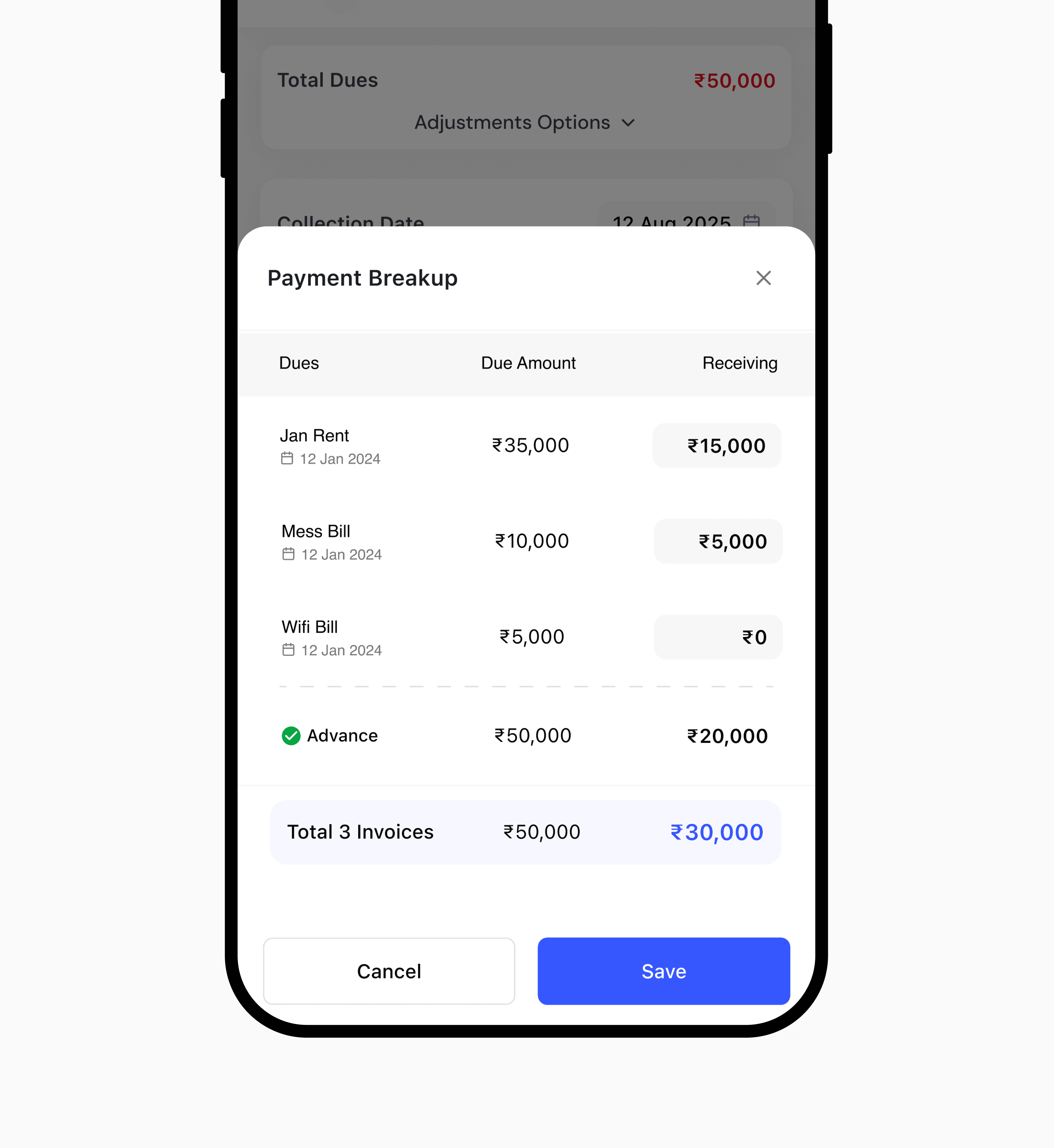
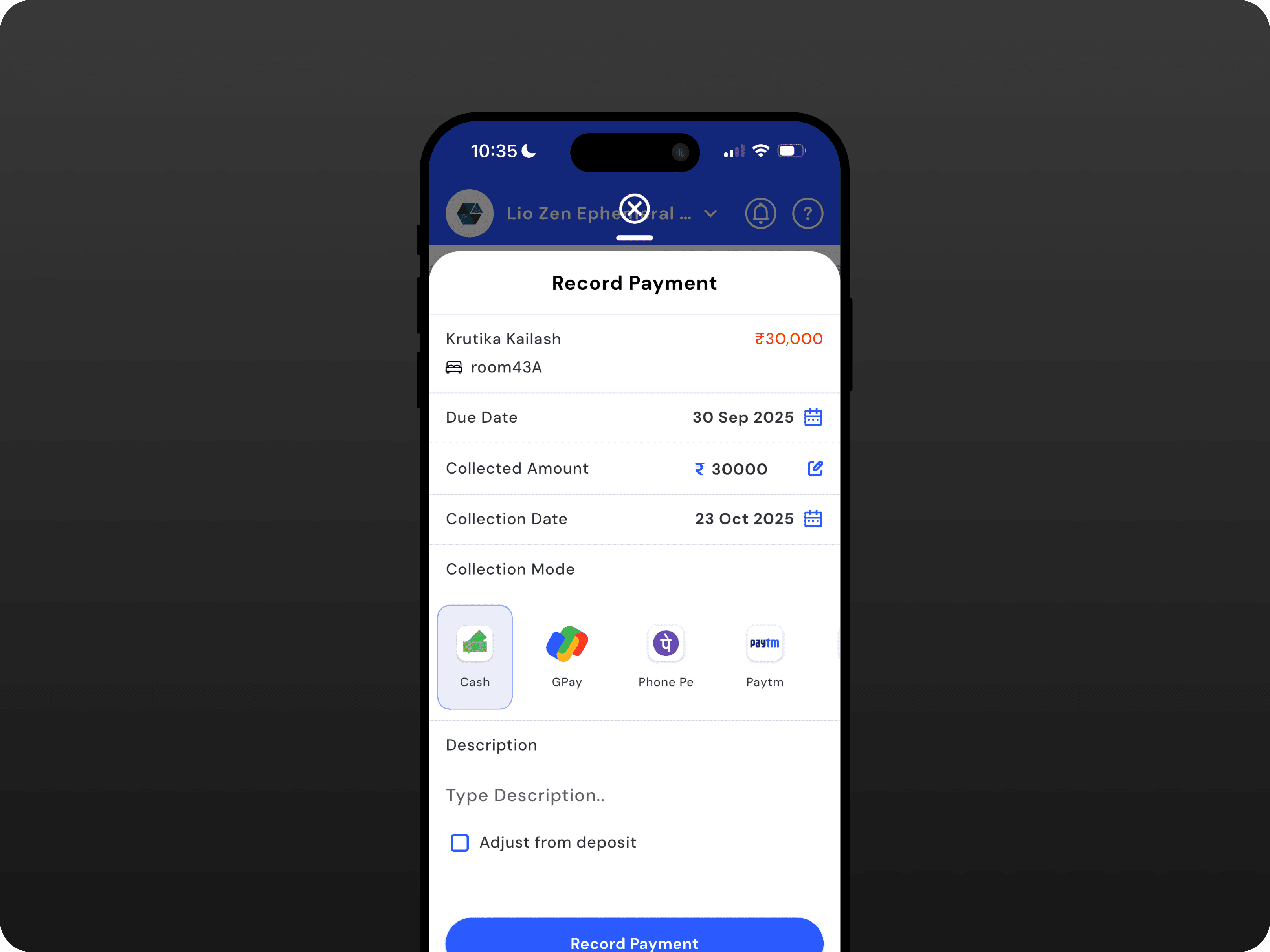
Amount Entry + Intelligent Allocation
Lets managers enter the received amount and instantly view or edit how it’s allocated across multiple invoices and prefilled using FIFO logic but fully editable for flexibility
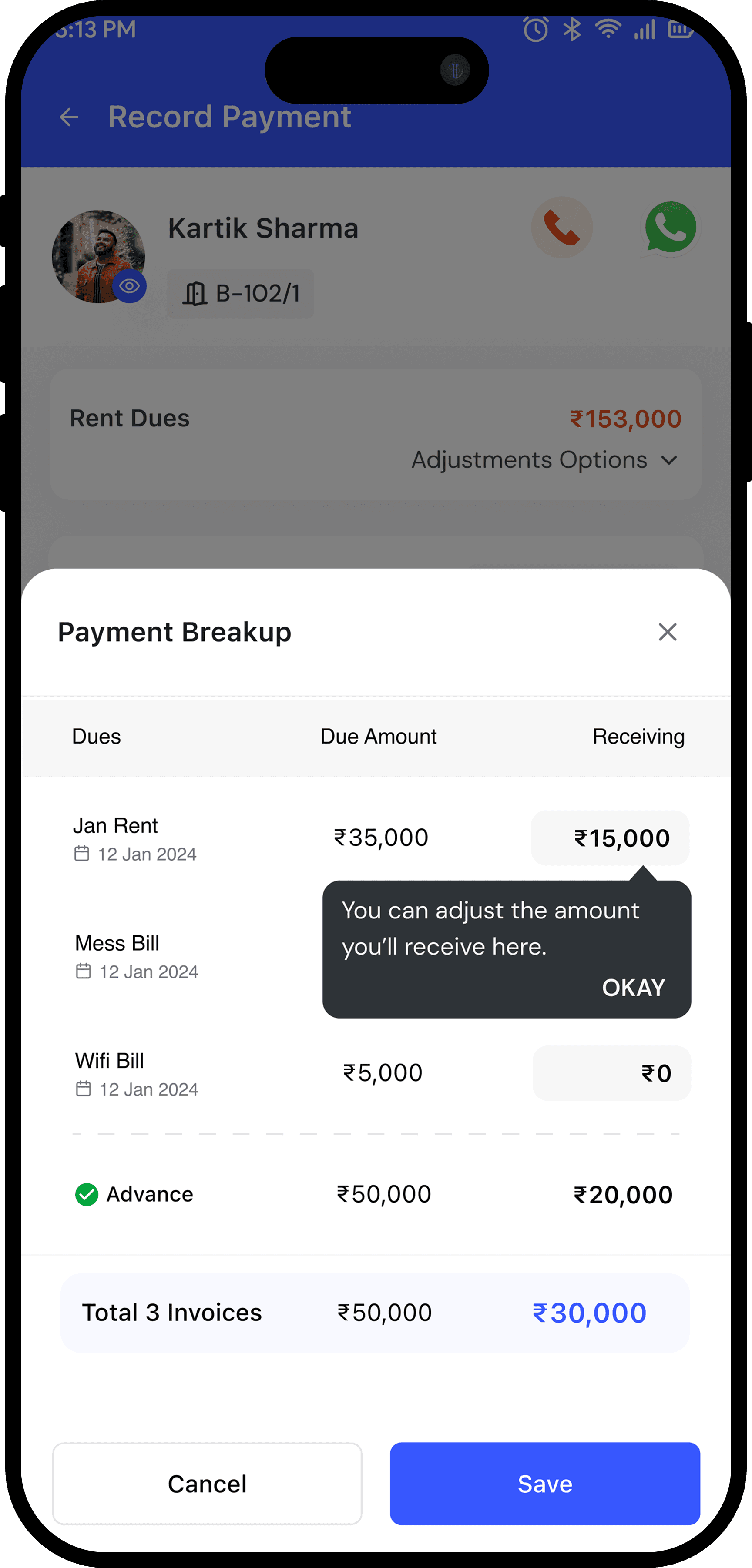
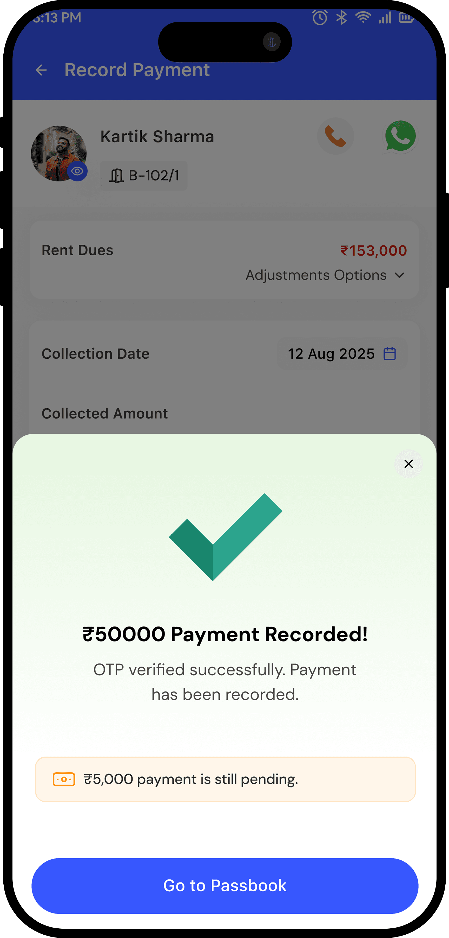
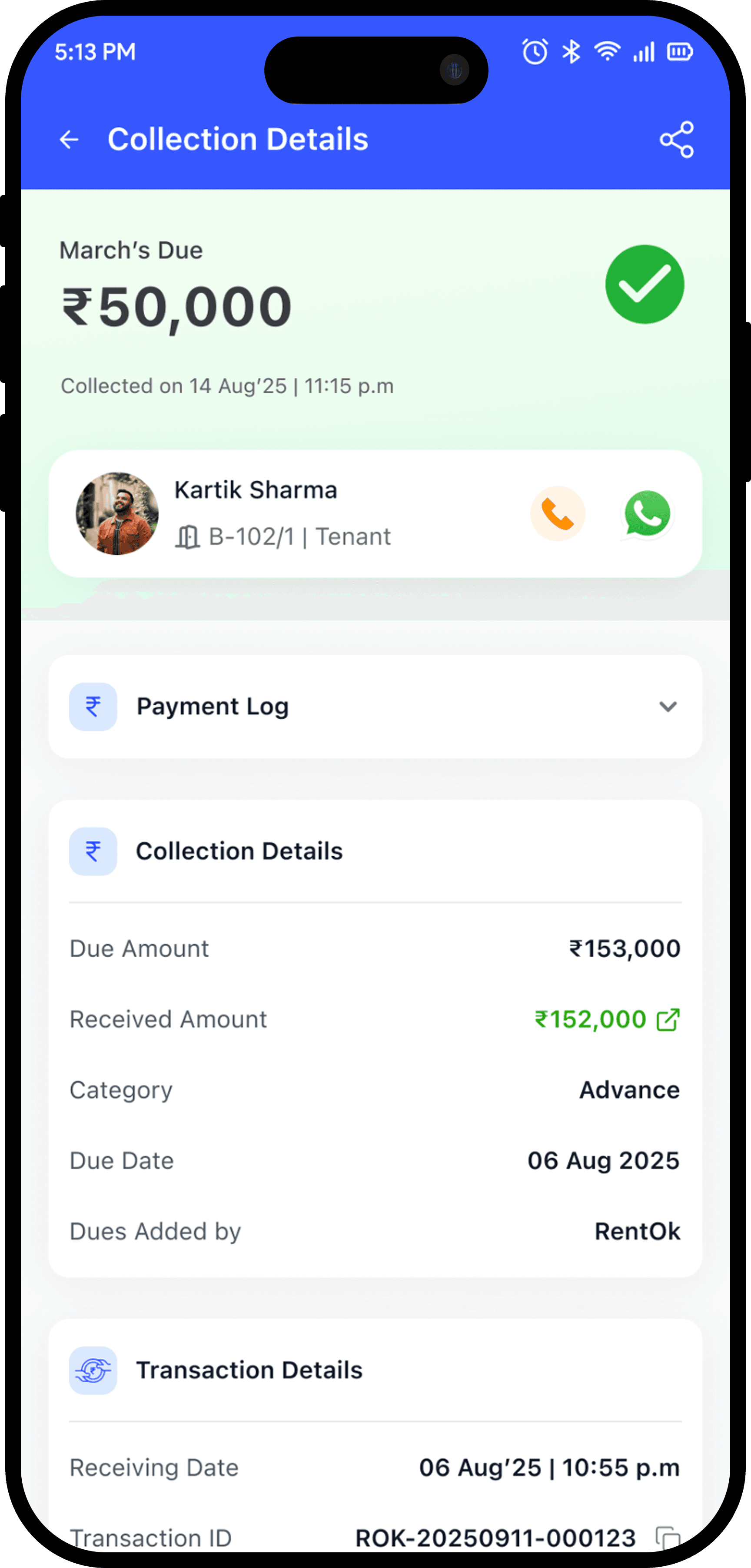
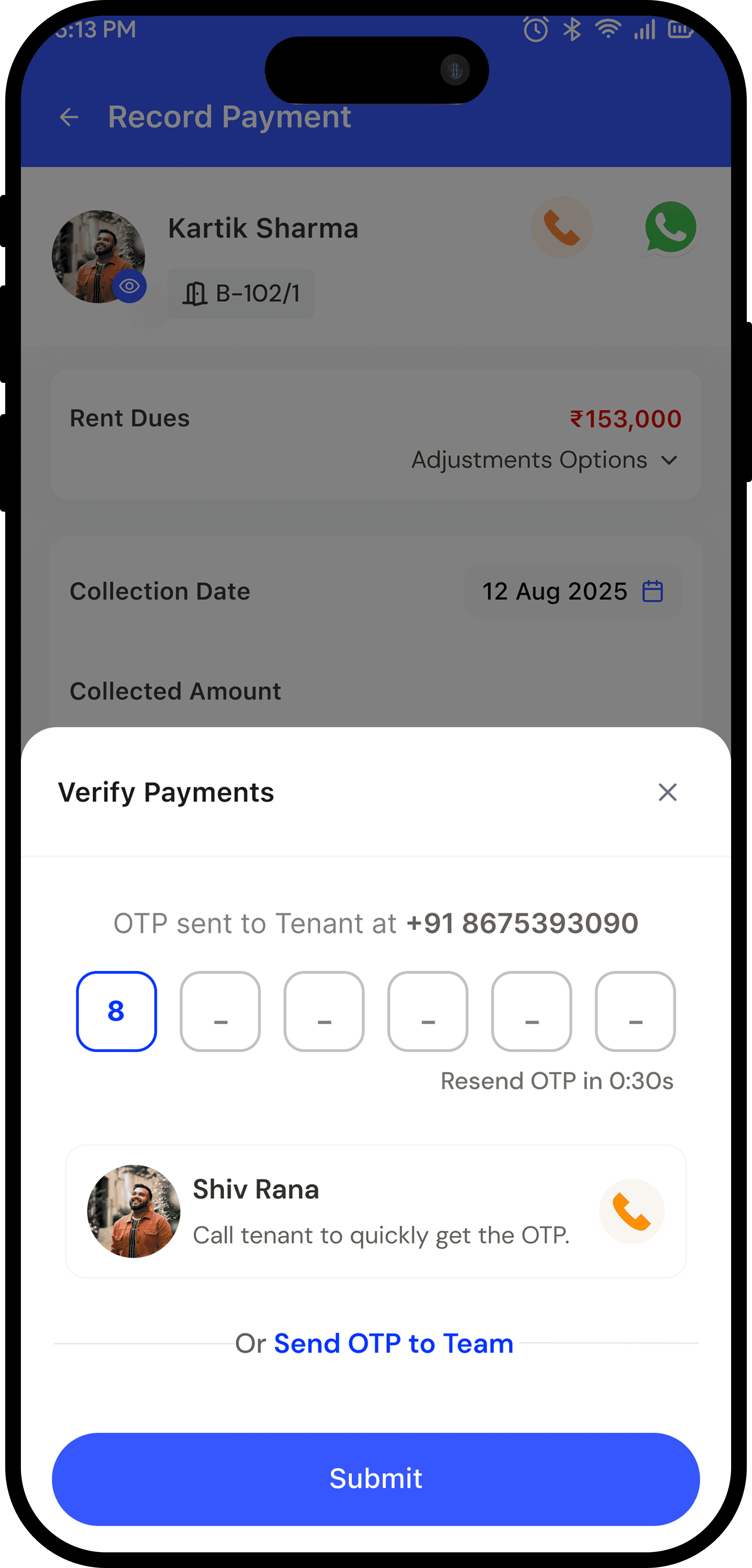
Collection Detail & Audit Trail
Every payment now carries complete traceability..showing mode breakdowns, reference IDs, user roles, refunds, discounts, and attachments in a single detailed view.

Reflection
This project taught me that financial UX is trust UX, not just numbers. Every design choice had to find balance:
Speed vs Accuracy — Defaults had to be fast but always reversible.
Transparency vs Overwhelm — Show the math, but don’t drown users in it.
Flexibility vs Guardrails — Give users control, but keep them safe from mistakes.
The most impactful moment was watching a property manager use the allocation override for the first time and smile "This is exactly how I think about it."
That's when you know you've designed the right solution :)
Cutting allocation errors by 92% while handling 3× the payment complexity
Team
Product Designer 2 Engineers Product Manager
My Role
End-to-end UX Architecture Design
Duration
2 weeks
Why we designed this?
Property managers using RentOK were recording payments in 30 seconds. Fast, right?
WRONG!
That 30 seconds only captured the payment itself. What it didn't capture was the 8 minutes that came after — managers opening spreadsheets, manually calculating how to split ₹50,000 across January rent, February advance, and a pending late fee.
They'd do the math, hope it was right, and pray the tenant wouldn't dispute it later.

When disputes happened, there was no record of why they allocated the money that way
What we discovered
We interviewed 12 property managers and analyzed 500+ payment transactions. What we found:
73%
of payments involved multiple dues
45%
required advance adjustments
28%
partial payments needing custom allocation
The system was designed for the happy path. But the happy path was the minority.
04 decisions that made it work
Net Payable + Dynamic Adjustments
Shows total dues with real-time recalculations when applying advances, deposits, or discounts, giving managers complete visibility before confirming payments

Amount Entry + Intelligent Allocation
Lets managers enter the received amount and instantly view or edit how it's allocated across multiple invoices — prefilled using FIFO logic but fully editable for flexibility
Collection Detail & Audit Trail
Every payment now carries complete traceability — showing mode breakdowns, reference IDs, user roles, refunds, discounts, and attachments in a single detailed view.

The Impact
87%
of managers adopted automated allocation
92%
reduction in allocation errors


Reflection
This project taught me that financial UX is trust UX, not just numbers. Every design choice had to find balance:
Speed vs Accuracy — Defaults had to be fast but always reversible.
Transparency vs Overwhelm — Show the math, but don't drown users in it.
Flexibility vs Guardrails — Give users control, but keep them safe from mistakes.
“The most impactful moment was watching a property manager use the allocation override for the first time and smile — 'This is exactly how I think about it.' That's when you know you've designed the right solution :)”
Cutting allocation errors by 92% while handling 3× the payment complexity
Team
Product Designer 2 Engineers Product Manager
My Role
End-to-end UX Architecture Design
Duration
2 weeks
Why we designed this?
Property managers using RentOK were recording payments in 30 seconds. Fast, right?
WRONG!
That 30 seconds only captured the payment itself. What it didn't capture was the 8 minutes that came after — managers opening spreadsheets, manually calculating how to split ₹50,000 across January rent, February advance, and a pending late fee.
They'd do the math, hope it was right, and pray the tenant wouldn't dispute it later.
When disputes happened, there was no record of why they allocated the money that way
What we discovered
We interviewed 12 property managers and analyzed 500+ payment transactions. What we found:
73%
of payments involved multiple dues
45%
required advance adjustments
28%
partial payments needing custom allocation
The system was designed for the happy path. But the happy path was the minority.
04 decisions that made it work
Net Payable + Dynamic Adjustments
Shows total dues with real-time recalculations when applying advances, deposits, or discounts, giving managers complete visibility before confirming payments
Amount Entry + Intelligent Allocation
Lets managers enter the received amount and instantly view or edit how it's allocated across multiple invoices — prefilled using FIFO logic but fully editable for flexibility
Collection Detail & Audit Trail
Every payment now carries complete traceability — showing mode breakdowns, reference IDs, user roles, refunds, discounts, and attachments in a single detailed view.
The Impact
87%
of managers adopted automated allocation
92%
reduction in allocation errors
Reflection
This project taught me that financial UX is trust UX, not just numbers. Every design choice had to find balance:
Speed vs Accuracy — Defaults had to be fast but always reversible.
Transparency vs Overwhelm — Show the math, but don't drown users in it.
Flexibility vs Guardrails — Give users control, but keep them safe from mistakes.
“The most impactful moment was watching a property manager use the allocation override for the first time and smile — 'This is exactly how I think about it.' That's when you know you've designed the right solution :)”